

UX Research Isn’t About Testing Products, It’s About Preserving Meaning
- Tanvi Mehta

- Jan 1
- 3 min read
Updated: Jan 7

In product teams, we celebrate building, shipping, and testing. But the biggest risk in product development isn’t choosing the wrong feature; it’s misunderstanding why users behave the way they do. Collecting feedback is easy. Preserving its meaning is the real challenge.
Most usability tests capture what users say and do. Very few capture what users expect, how those expectations shift, and how they feel when reality doesn’t match. And that gap, the space between prediction and outcome, is where the truth lives.
Where UX Research Quietly Fails
A typical research workflow looks like this:
Test with a handful of users
Observe tasks
Capture reactions
Summarize later
The failure doesn’t happen during the sessions. It happens during synthesis, when nuance gets flattened into bullet points:
Expectations become quotes
Emotions become labels
Confusion becomes a “usability issue.”
Context becomes a footnote
The insights are technically correct but conceptually incomplete. An incomplete understanding leads to confident, wrong decisions.
The Reality of Testing
Anyone who has run real sessions knows the chaos: Every participant interacts with dozens of elements. For each moment, there is:
What they expect
What actually happens
How they feel about the gap
How they explain it afterwards
AI can capture words. It struggles to capture contrast, the difference between what users thought would happen and what did happen. That’s where meaning disappears.
The Shift: You’re Testing Expectations, Not Screens
Every interaction is a prediction:
“I think this will do X.”
“I expect this means Y.”
“I assume this leads to Z.”
Good design aligns with expectations. Bad design violates them, even when the feature “works.”
When research ignores expectations, teams argue about symptoms instead of causes.
Examples of Where Meaning Gets Lost
Example 1: Imagine your team launches a new feature. Initial research shows users find it confusing. The team fixes the flow, simplifies the interface, and everything looks better on paper. But adoption still lags. Why? Because the real issue wasn’t the flow, it was that users expected the feature to solve a different problem. That disconnect between expectation and reality isn’t in the data; it’s in the meaning behind the data.
Example 2: Let’s say a team redesigns a signup form. They strip it down to just two steps, super streamlined. But signups still don’t increase. The problem wasn’t complexity; it was trust. Users didn’t trust the product enough to fill in their information, no matter how easy the form became.
When we flatten these nuances into bullet points or click-through rates, we lose the context that should guide design decisions. We end up solving symptoms, not causes.
A Framework for Preserving Meaning
To protect nuance, I use a simple structure:
Landing Page | Icon 1 | Icon 2 | Feature | |
Participant 1 |  | |  |  |
Participant 2 |  |  |  |  |
Participant 3 |  |  | 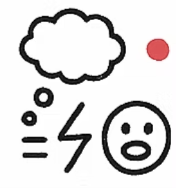 |  |
Columns = features/icons/pages/interactions
Rows = participants
Each cell contains:
💭 What the user expected
⚡ What actually happened
🙂 / 😕 / 😡 How they felt about the gap
💭 What the user expected
⚡ What actually happened
🙂 / 😕 / 😡 How they felt about the gap
This keeps each user’s thinking intact, long enough for patterns to emerge.
PHASE 1: Before the Product
Before showing anything, understand the user’s world:
How they currently solve the problem
What frustrates them
What “success” looks like
Their mental model going in
This baseline becomes the lens through which they interpret everything else.
PHASE 2: First Contact
Next, observe how expectations form before interaction:
First impressions
Assumptions
What they think each feature/page/icon does
The language they use
Expectations often form before the first click.
PHASE 3: Expectation Alignment Grid
For each feature, capture:
💭 Expectation
⚡ What happened
🙂 / 😕 / 😡 Emotion
This is the heart of the framework.
PHASE 4: Pattern Recognition with Red & Green Dots
Once the grid is filled, zoom out.
Add:
🟢 Green dots above features where expectations aligned
🔴 Red dots where expectations failed
This makes systemic issues instantly visible, without over-synthesizing.
You’ll see:
Clusters of misunderstanding
Emotional volatility
Features that work as intended
Features that need redesign
PHASE 5: Decision Making
The framework doesn’t just document feedback. It directs decisions by revealing:
Where clarity is needed
Which issues are systemic vs. isolated
Where design is working as intended
This shifts teams from debating opinions to responding to patterns.
Why This Matters
This approach reframes how teams think:
Design: clarity beats cleverness
Product: alignment beats feature count
Research: synthesis is a design act
Great products don’t remove all friction. They remove surprise where it matters most.
Final Thought
Most UX research fails quietly, not because the data is wrong, but because meaning gets flattened too early.
When we lose expectations, we lose understanding. When we lose understanding, we ship confidently in the wrong direction.
UX research isn’t about testing products. It’s about protecting how users think, long enough for patterns to tell the truth.
I really enjoyed reading this post. Capturing users’ expectations and emotions is so important, as it often reveals insights that numbers alone can’t show. This approach reminds me of how careful analysis, like using cytokine assay services, can uncover subtle details that make a big difference in results and decision-making.